Getting Started With Orange Tool
Orange is an open source, component-based software written in Python language that works best for machine learning and data mining — namely, visualization. These components are called widgets and they range from visualization to pre-processing, evaluation and predictive modeling.
Orange allows you to:
– Show a data table and select features
– Read the data
– Compare learning algorithms and train predictors
– Visualize data elements
Orange tool consists of various items to be used for the machine learning and data science.
- Canvas : Provides UI for data analysis.
- Widget : Used to use the various items such as data, visualize or any machine learning modal.
Use of Orange Tool:
Firstly, we open the Orange tool and create a simple workflow as shown in image below with various widgets such as File, Data info, Data table, scatter plot and Distributions. Once creating we connect them using the common connectors to the file.

Next, Here we have selected housing dataset which consists of 4 attributes and 150 features. The dataset is used for the regression based machine learning models.

We can observe the information related to dataset on double clicking on Data info widget.

We can observe the whole dataset with variable labels and Instance classes inside the data table widget.

We can use the scatter plot widget to visualize and compare 2 features. The below scatter plot is plotted for LSTAT and RM.

Data distribution widget is a graphical visualization of features normally a Bar graph by clicking on distribution widget. We can observe Frequency distribution of each Attribute individually. Distribution of sepal width variable is shown in below figure

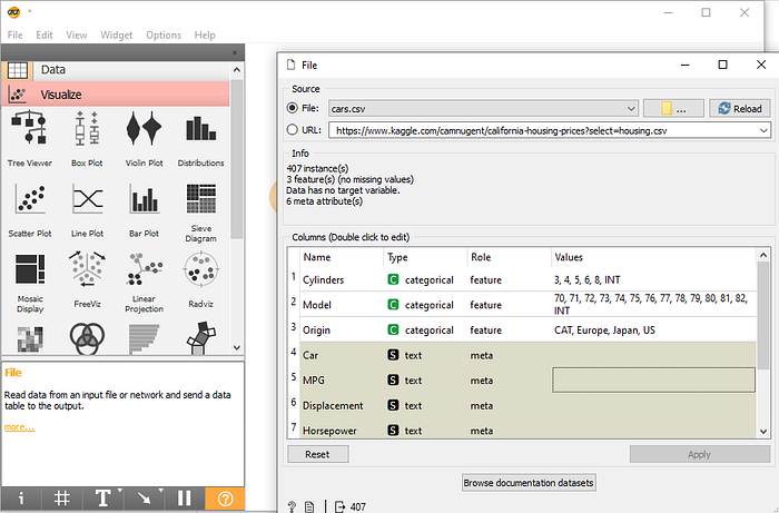
Generally we can also import dataset from webpage or GitHub link. Below image shows by going into URL section inside Files Widget we can paste any dataset link from web to use it for visualization

In this blog, we have discussed the basics of Orange tool with a simple visualization.
